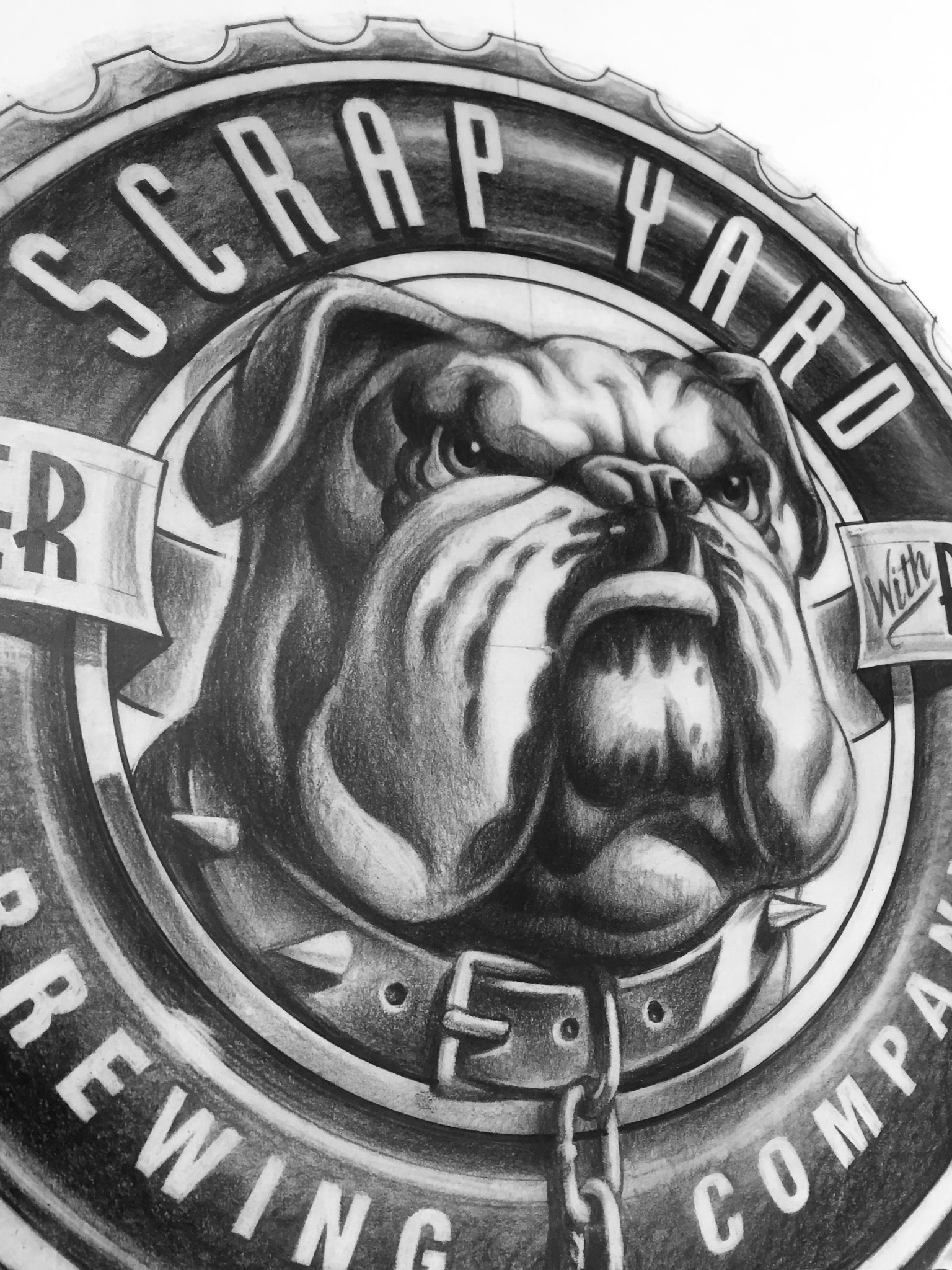
Illustrator: Mark Bender | Art Direction: John Baldridge | Client: Scrap Yard Brewing Company
I was the art director for this project. This packaging logo was created for a sustainable brewery that reuses most of their materials and rewards customers for re-using bottles, and refilling at the location. The goal of the brewery was to divert 99.9 percent of its waste from landfills and has reduced water use per barrel of beer to 3.5:1 (averages range from 6:1 to 10:1).

Illustrator: Mark Bender | Art Direction: John Baldridge | Client: Scrap Yard Brewing Company
Environmental stewardship is a top priority for both craft brewers and craft beer enthusiasts. Maintaining a healthy balance between stewardship, social enrichment, and economic vitality is important to the future success of craft brewing. I was an equity partner in this brewery, but unfortunately we did not secure that capital needed to get off the ground. That is why we only see the logo in draft form.
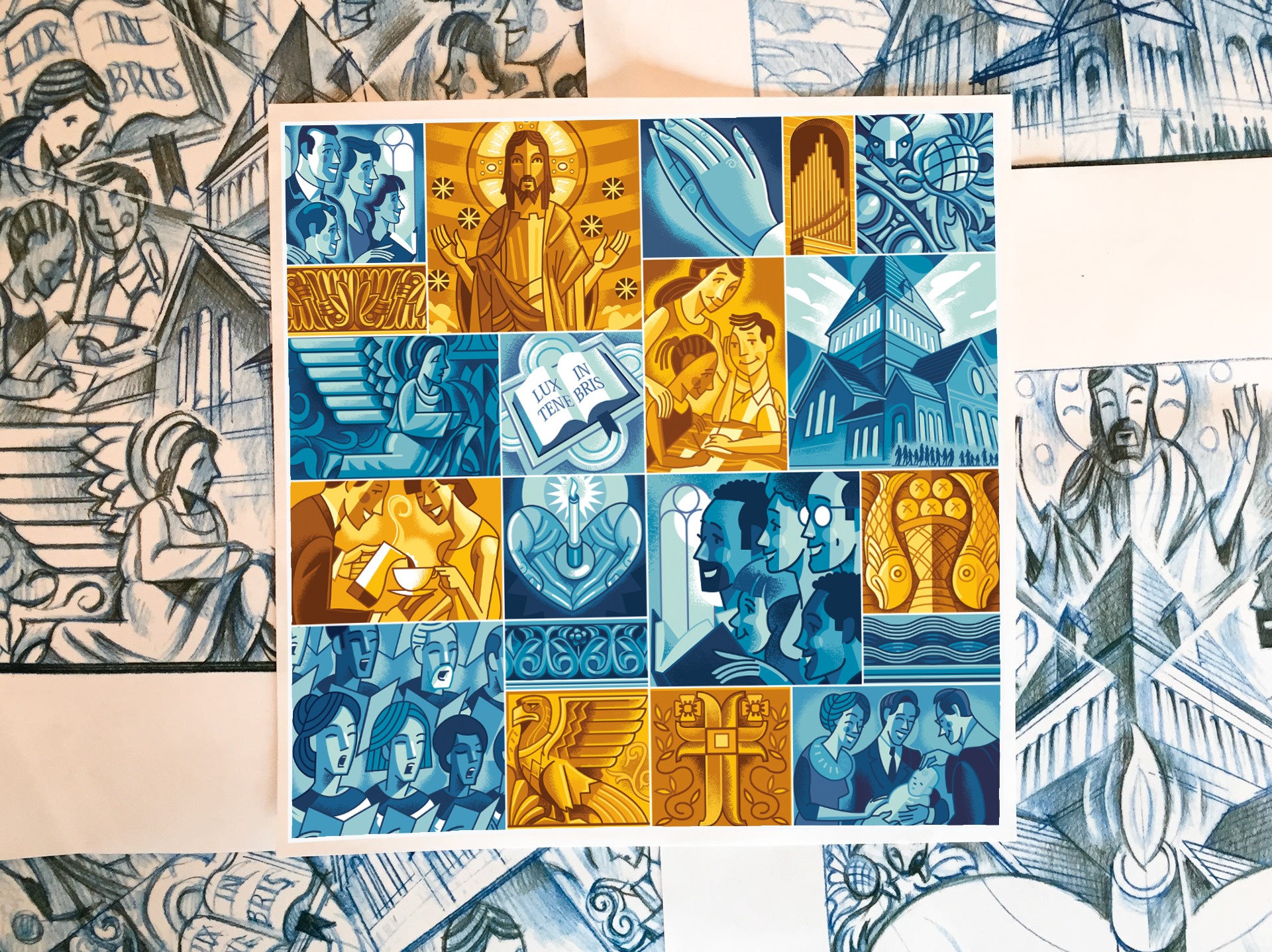
Illustrator: Mark Bender | Art Direction: John Baldridge | Client: Shadyside Presbyterian Church
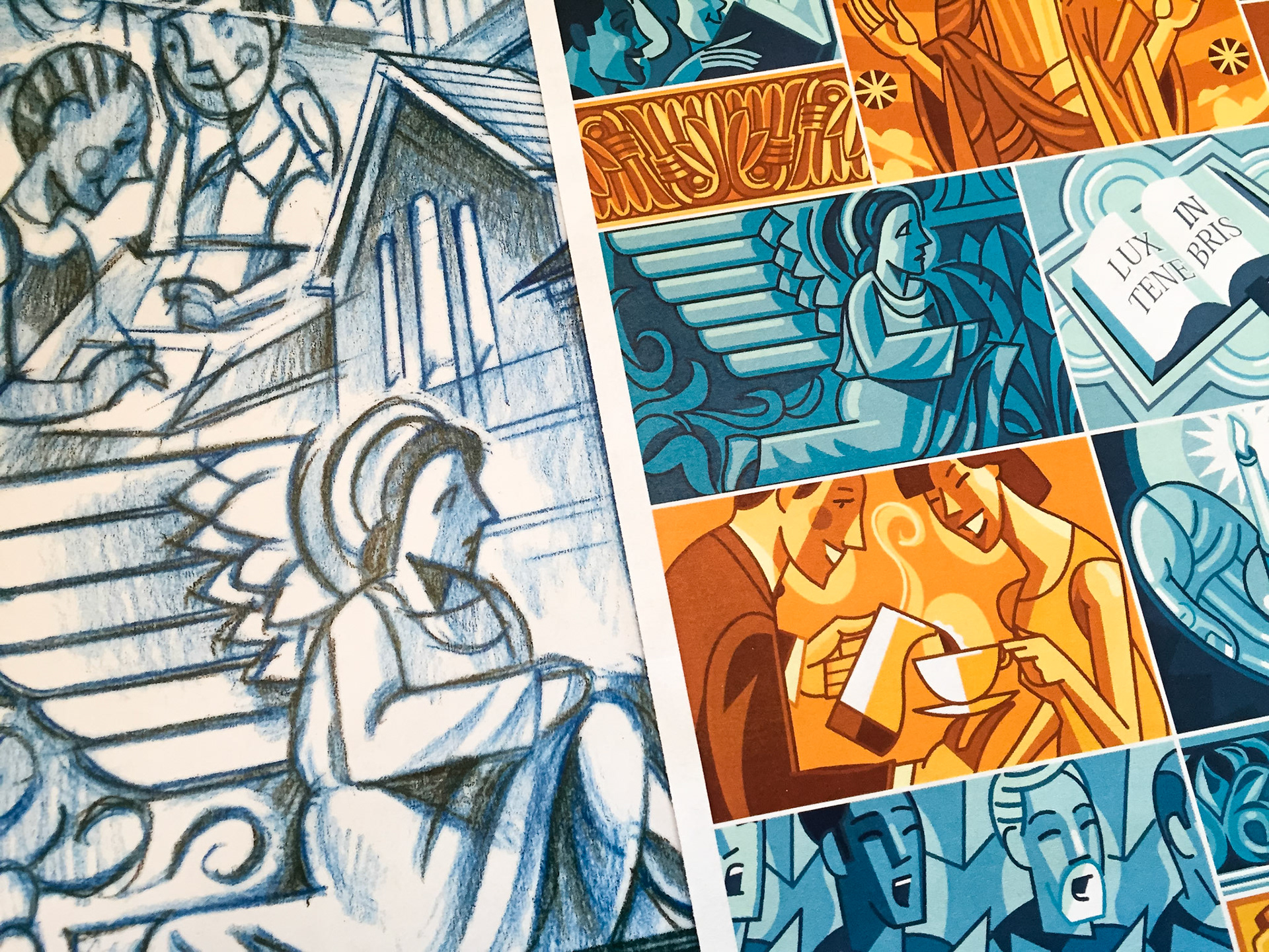
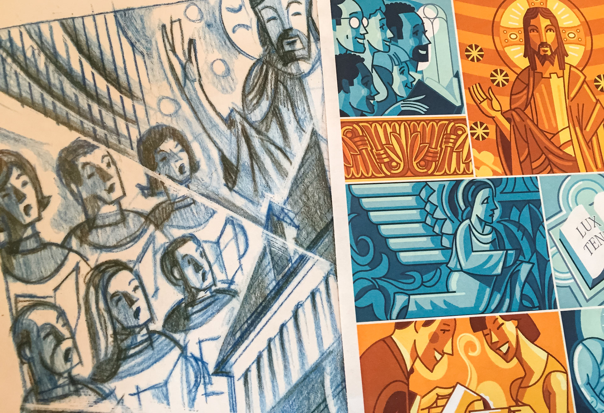
I was the art director on this project and worked with the talented Mark Bender to develop a fresh illustration brand for the historic Shadyside Presbyterian Church (SPC). The new "digital mosaic" was an illustration commissioned by the SPC communications committee and created by award-winning local artist and Chatham University professor, Mark Bender. SPC wanted to showcase their diverse and inclusive congregation and give new life to the main architectural details found in and around the building.
Illustrator: Mark Bender | Art Direction: John Baldridge | Client: Shadyside Presbyterian Church
Many of the architectural details in and around the building were brought to new life as Mark worked to find the hidden details and symbols that SPC could "own" and develop as part of their brand.
Illustrator: Mark Bender | Art Direction: John Baldridge | Client: Shadyside Presbyterian Church
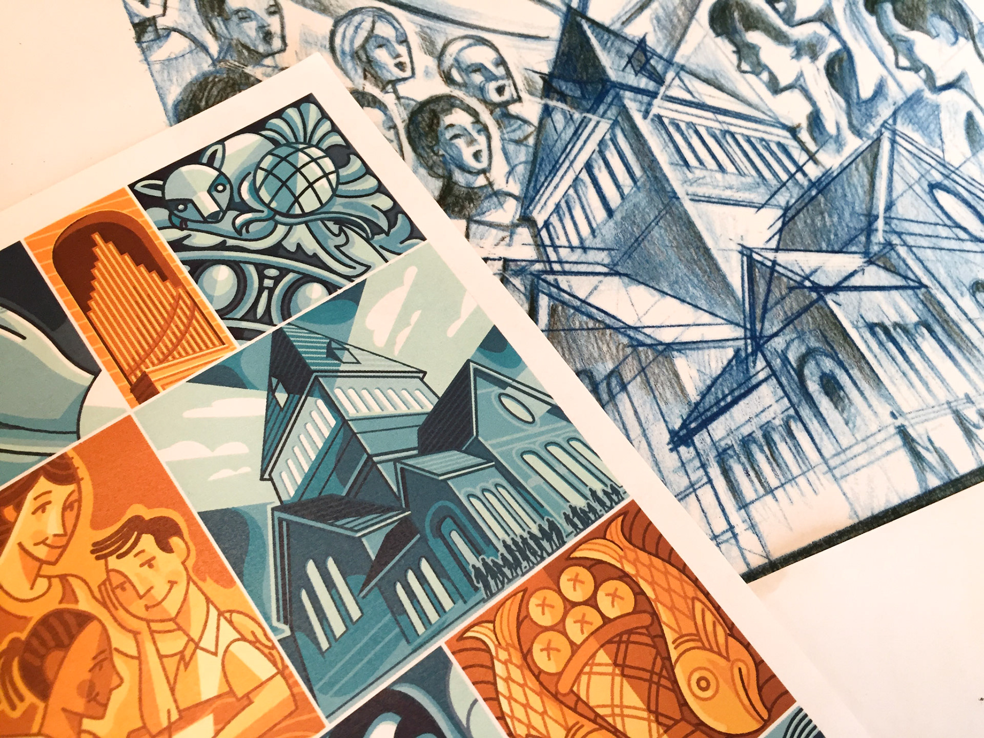
Many of the architectural details in and around the building were brought to new life as Mark worked to find the hidden details and symbols that SPC could "own" and develop as part of their brand.
Illustrator: Mark Bender | Art Direction: John Baldridge | Client: Shadyside Presbyterian Church
Many of the architectural details in and around the building were brought to new life as Mark worked to find the hidden details and symbols that SPC could "own" and develop as part of their brand.