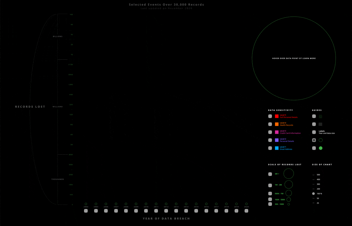
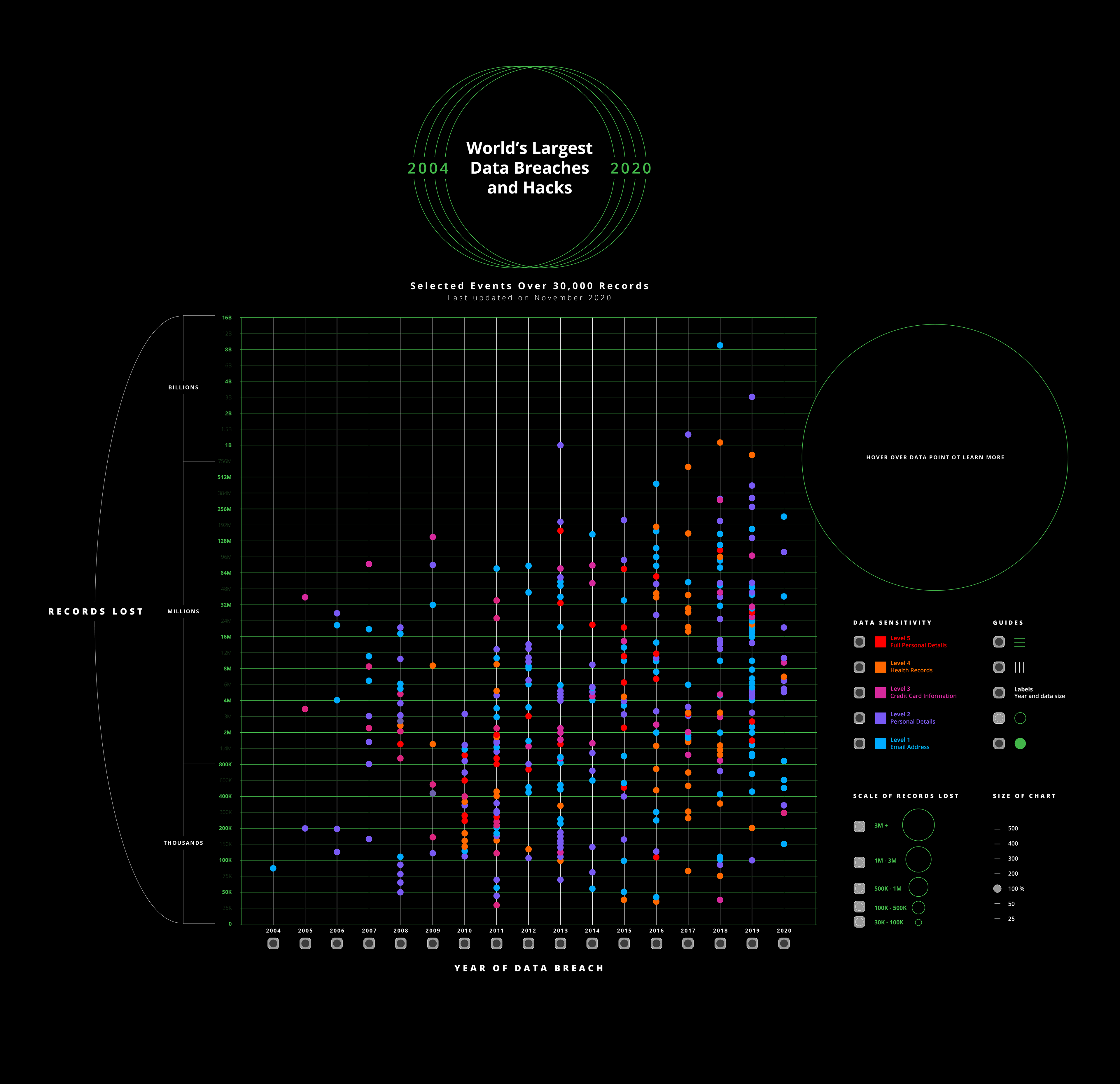
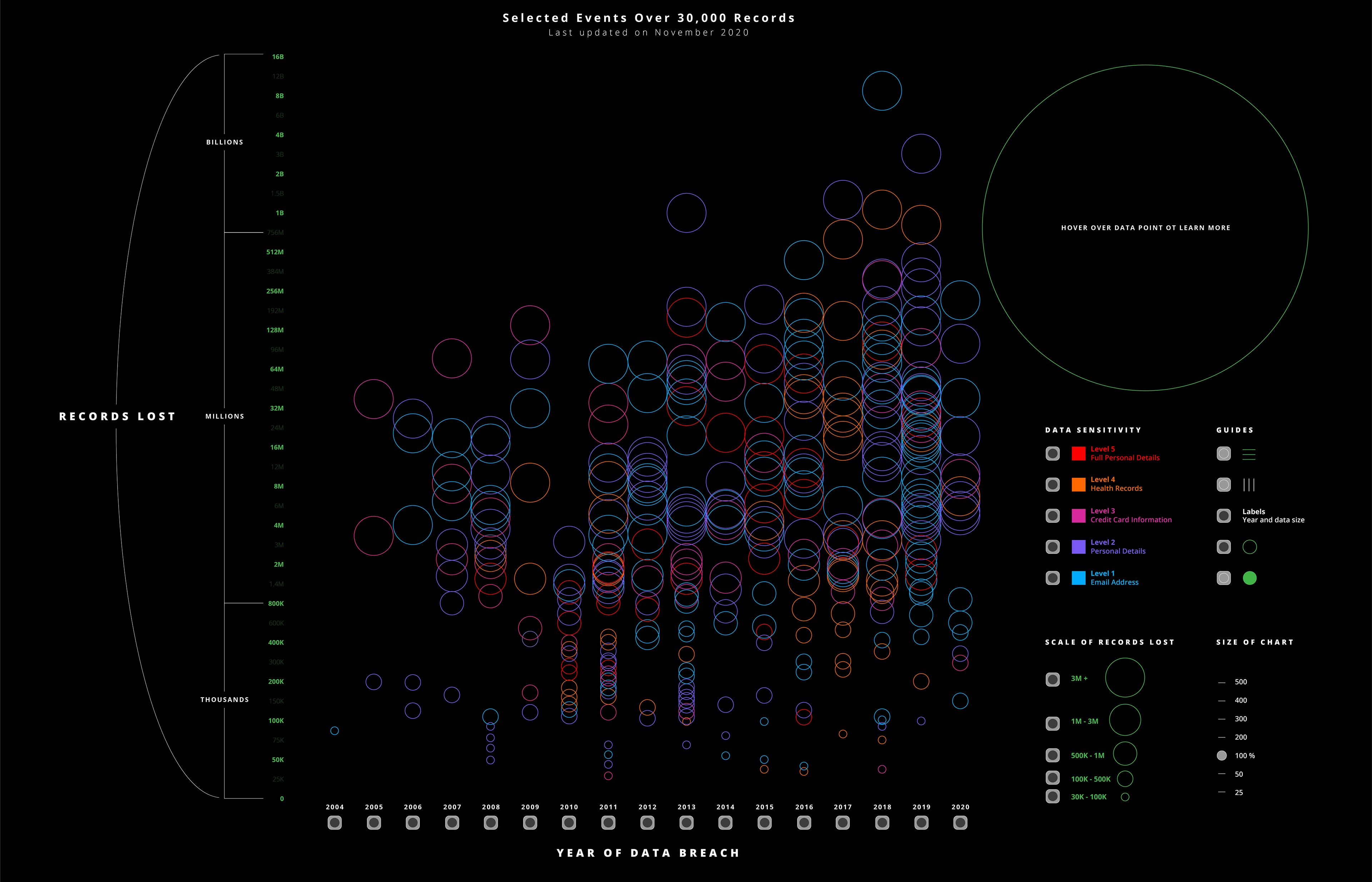
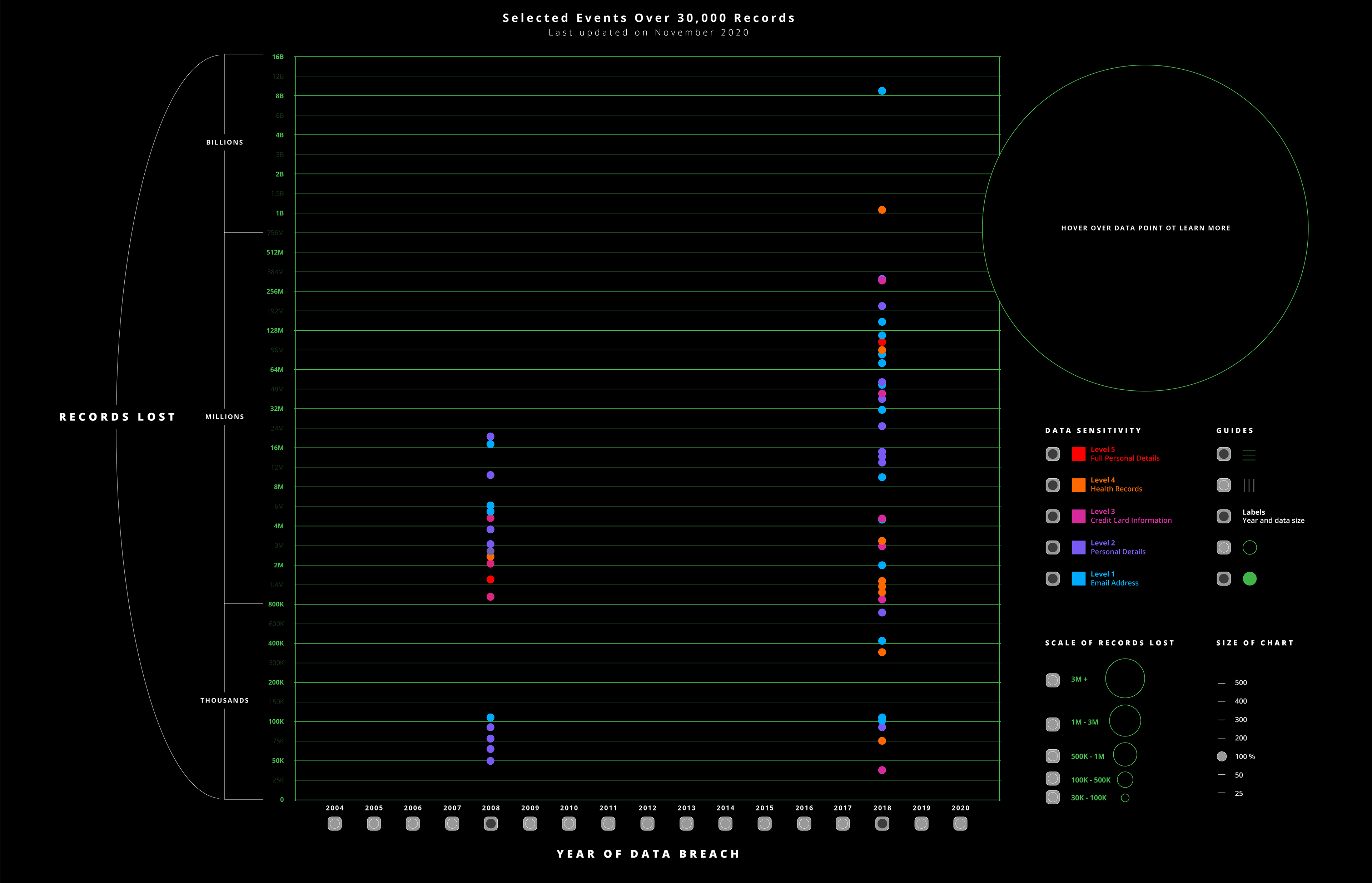
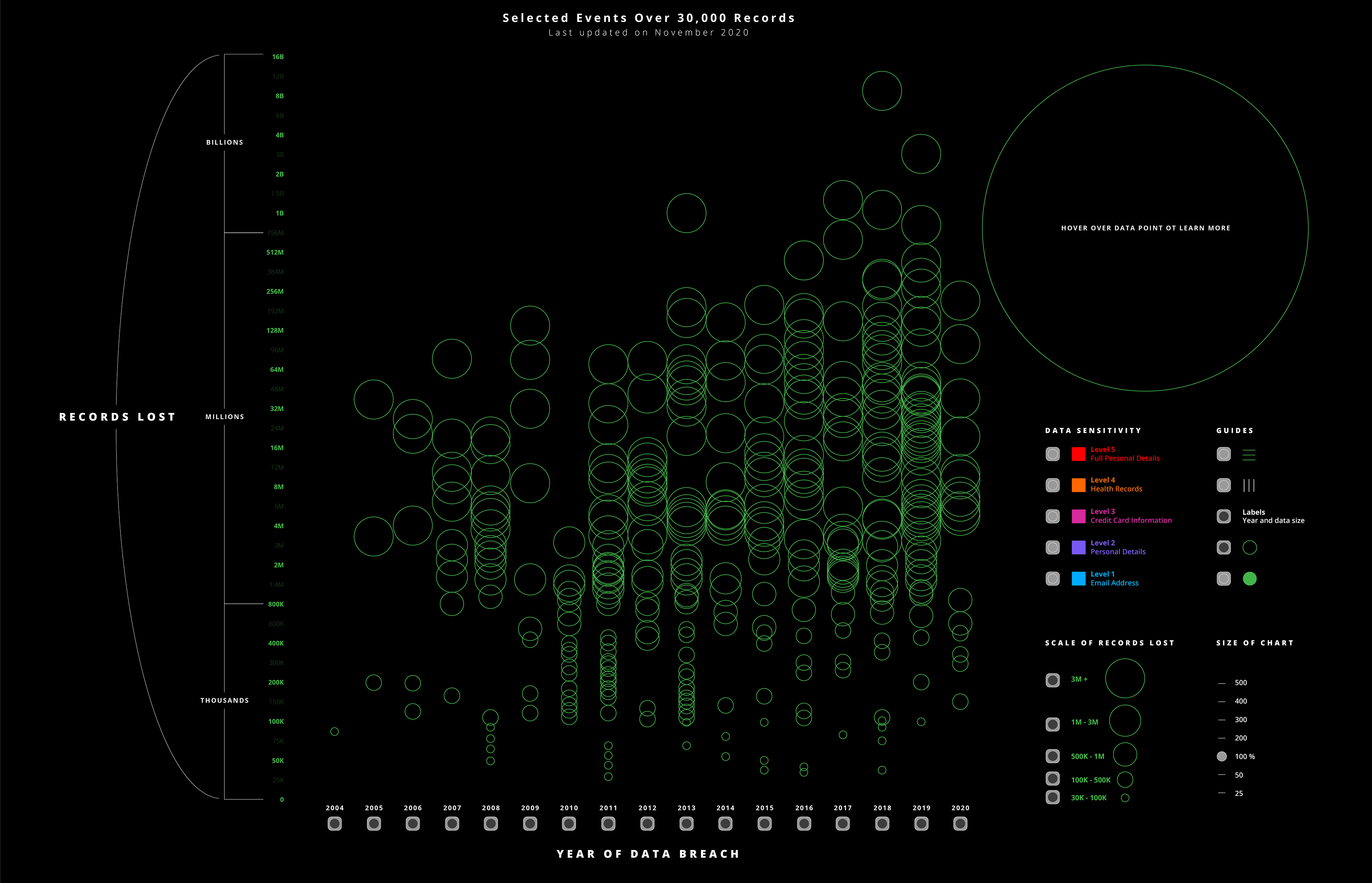
I created a data visualization that allowed users to explore the information by selecting key points of interests like data size, data sensitivity, and year.
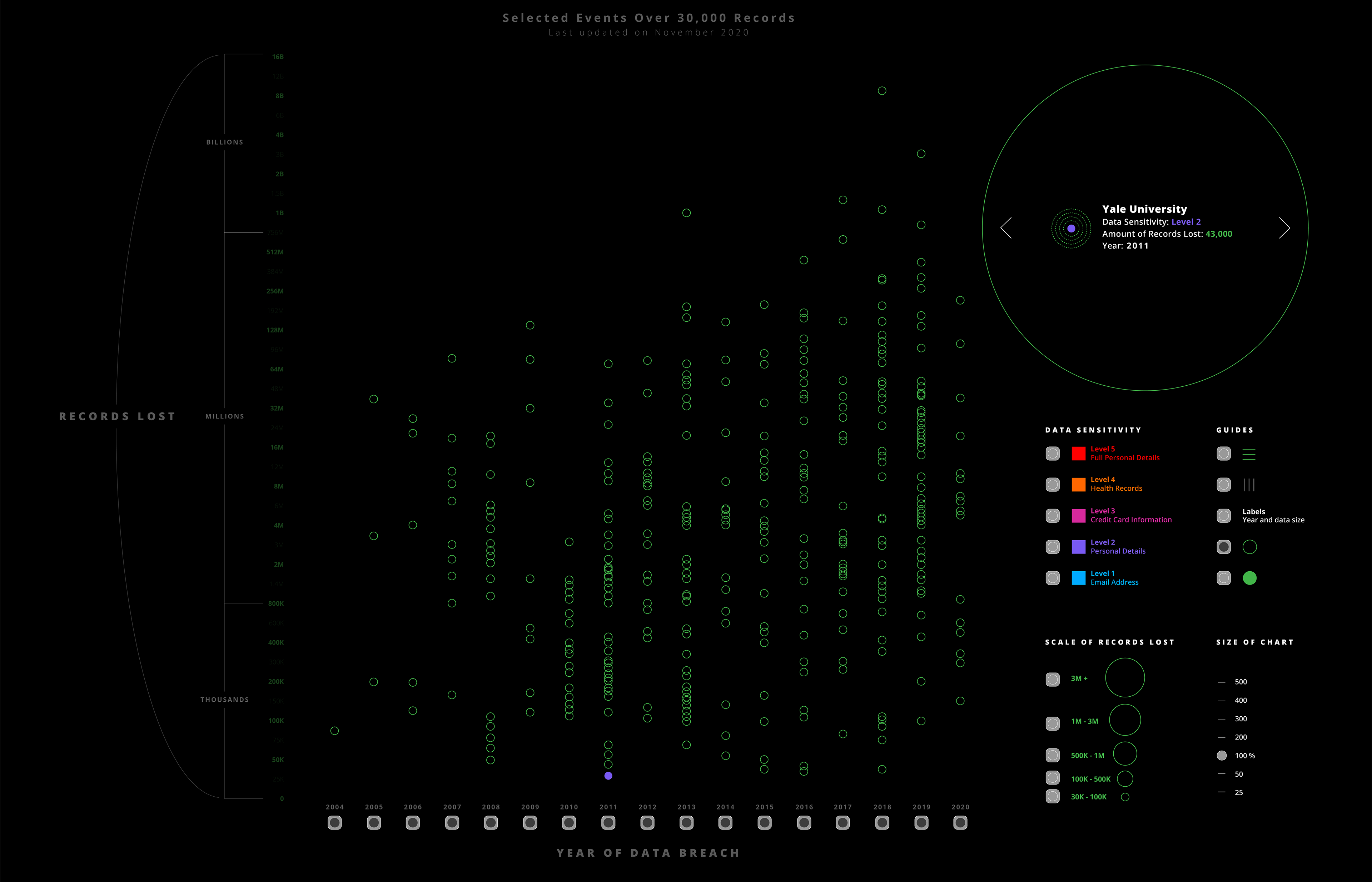
Using the key on the right side of their screen, the user can pick what information is important to them and compare and contrast years, data breach size, and data sensitivity levels.
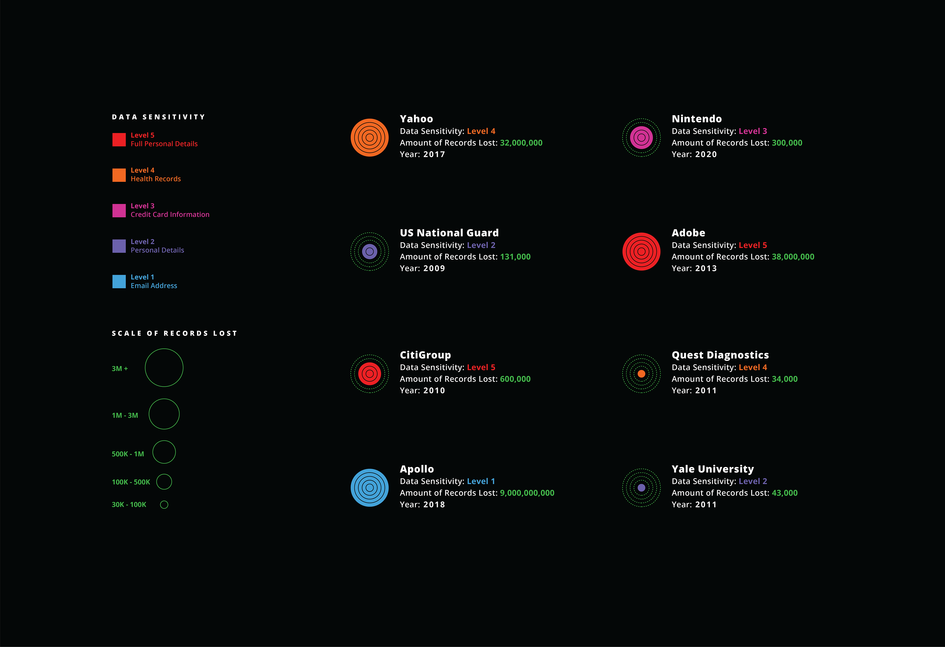
The circle icon on the left of each record also changes based on the unique combination of amount of records lost and data sensitivity. A full red circle is the worst-case scenario meaning over 3M full personal records lost (SSNs, banking information, etc.). Conversely, the largest data lost by Apollo at 9 Billion, was only a data sensitivity level 1 (email addresses and public information).
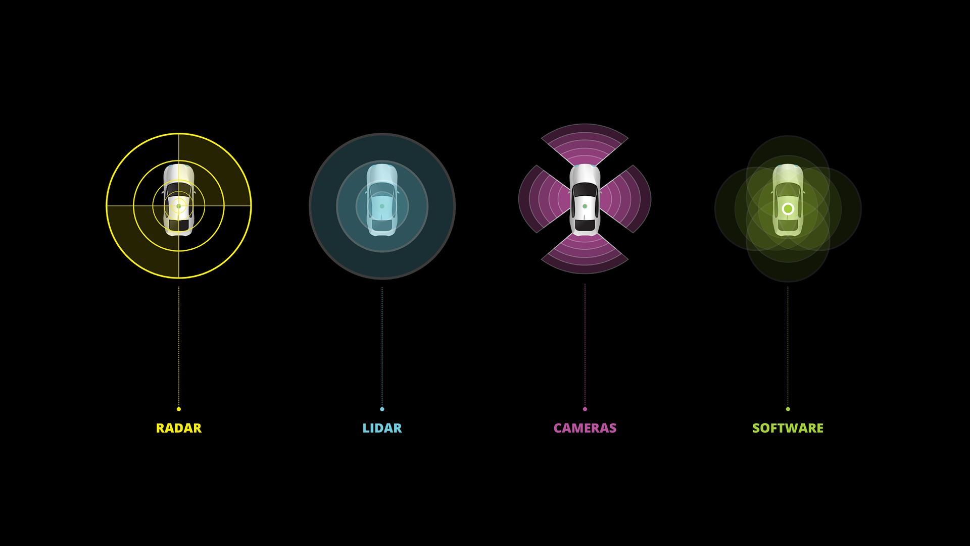
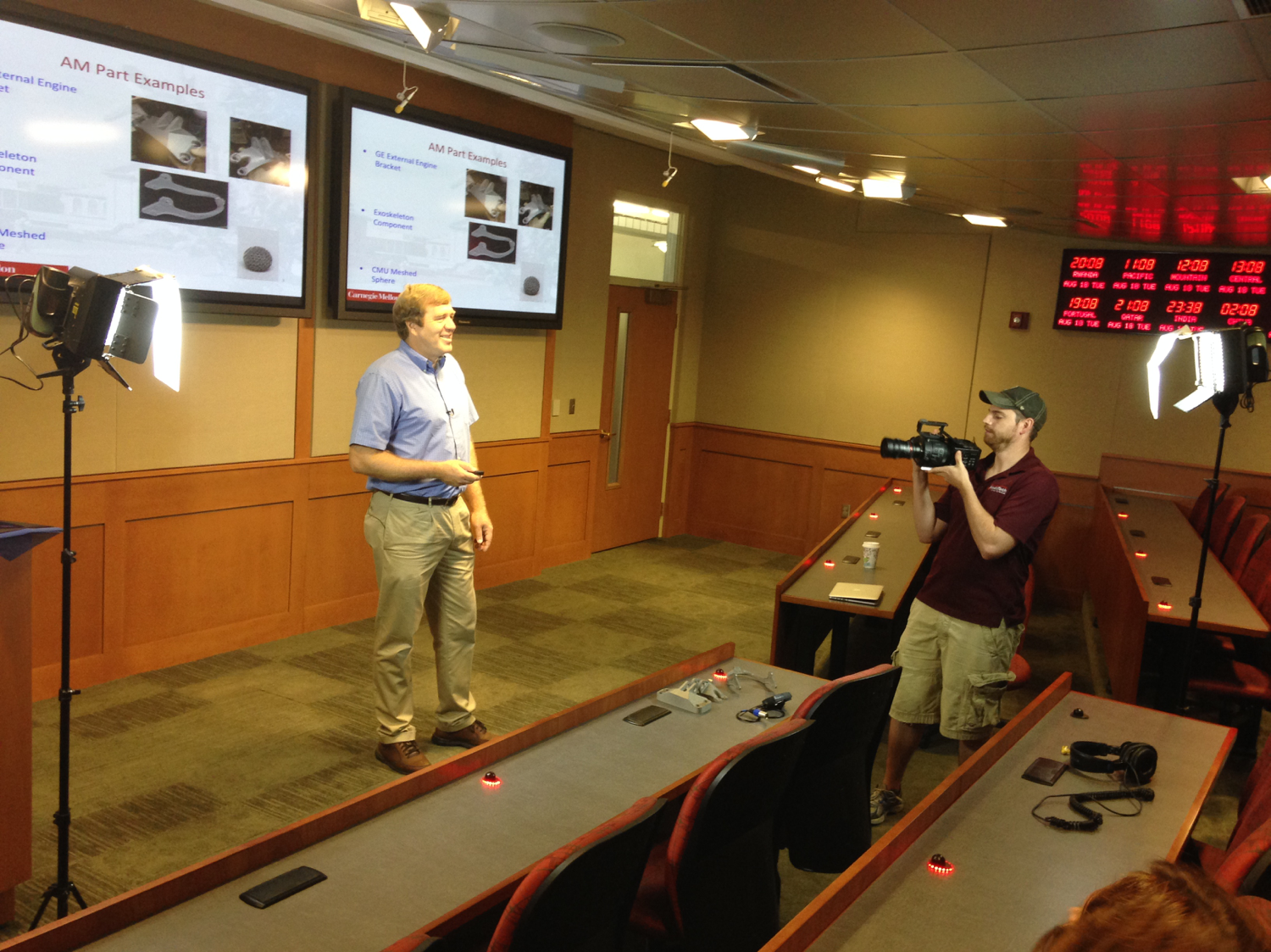
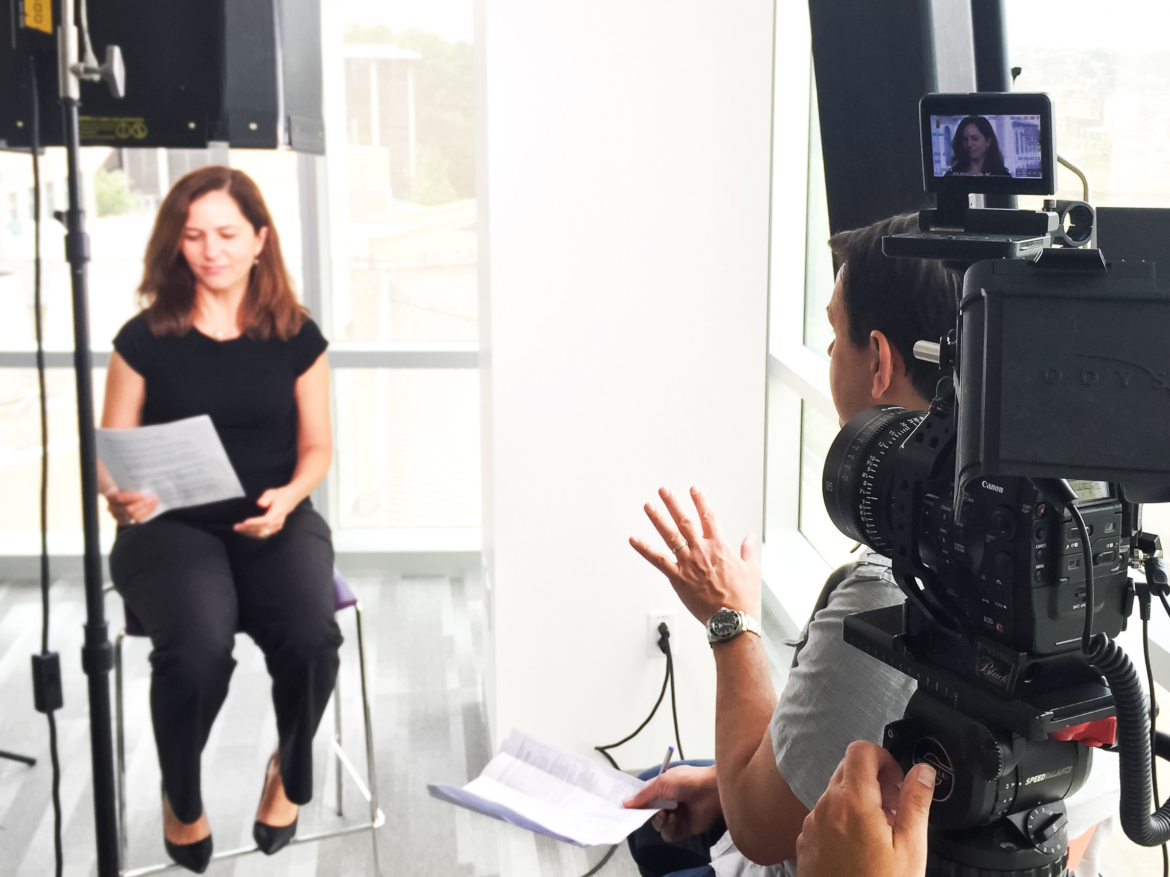
For project 2 in Communication Design Studio, we were tasked to address the challenge of making something abstract concrete. I was assigned to learn more about autonomous vehicles (or self-driving cars), and create a video that explains what they are and how they work. I wanted to define and assign each of the different main technologies that the autonomous vehicle is using to navigate space. I created a separate icon and color scheme and assigned one color for each action. This will allow me to highlight each technology and show are they are different.
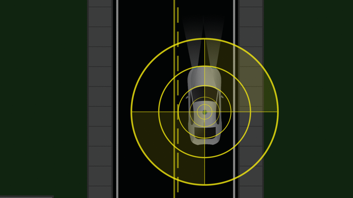
In addition to the RADAR system, the LiDAR is kind of like the eyes of the autonomous vehicle. The system provides a 360-degree view of the surrounding area which allows the vehicle to see things like a car getting to close, and then make snap adjustments in real time.