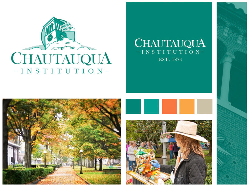
Challenge: Founded in 1874, Chautauqua Institution has enjoyed a rich tradition of being a haven for the intellectually curious. Today, Chautauqua continues that tradition through their educational services and offers learning opportunities in music, recreation, religion, and the arts. Chautauqua is an American treasure and like no other place in the world for one to pursue their dream. That being said, how can Chautauqua Institution ensure that they will have a strong and successful future?
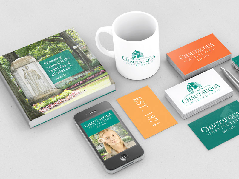
Solution: Millennials. The solution was a total re-branding effort that positions Chautauqua Institution as a leader in self-discovery education as well as home for the intellectually curious.
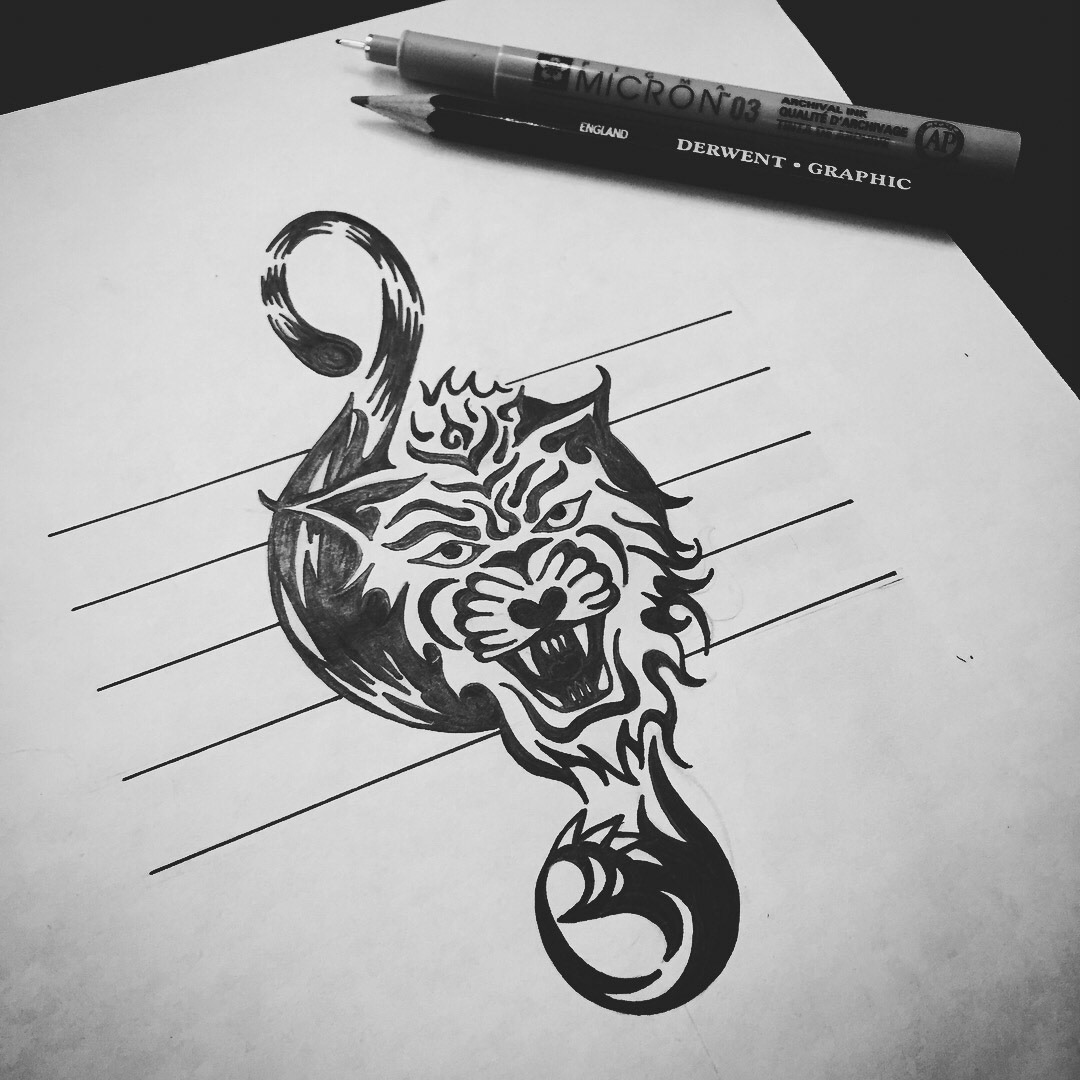
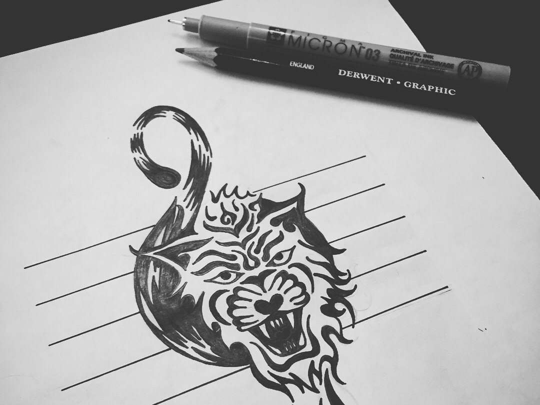
I was contacted by the music director of a local school that wanted to create a unique brand for the music department. She wanted the new logo to be related to but independent from the school's mascot, which was a tiger. Each athletic program at the school had a logo featuring the school's tiger mascot, and she felt her students were just as deserving. She wanted something the students could be proud of and want to wear on apparel.
After talking with her and learning more about her students, the school, and the vision of her students, I began to sketch out some ideas. One idea I had was to turn the treble clef into a preying tiger.
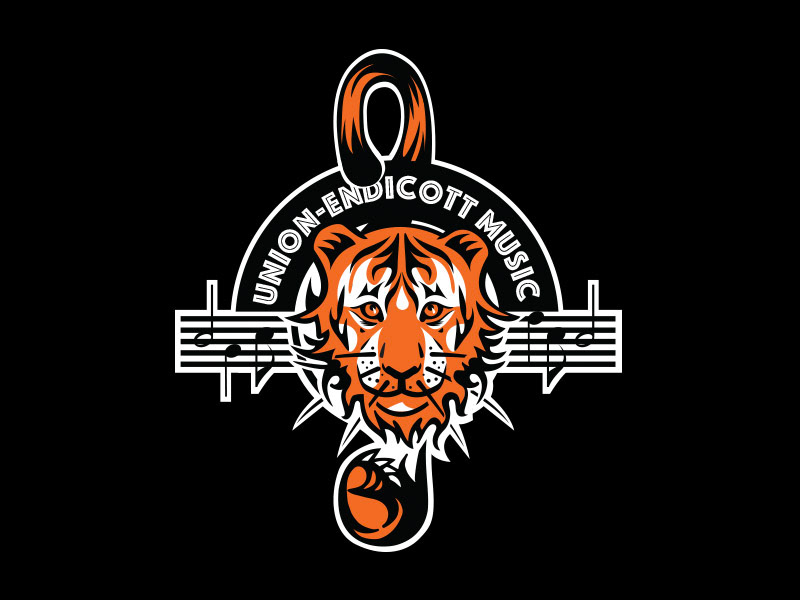
The choir a Union-Endicott was very happy with the initial sketch and wanted it turned into a full vector illustration with some modifications to the tiger's face.
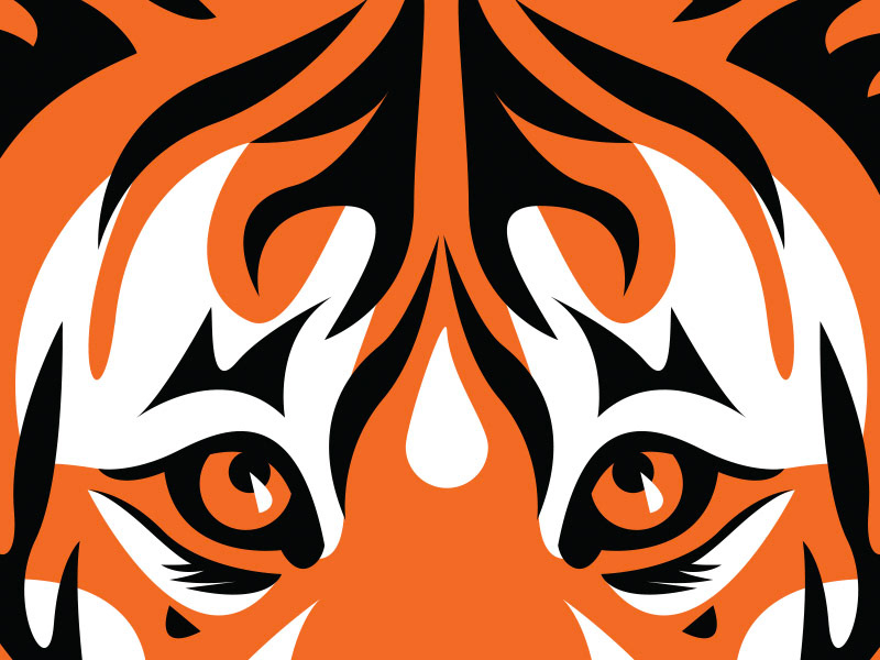
Here is a detail shot of the tiger's face that is now used as a pattern on travel bags, and other Union-Endicott Music department material.
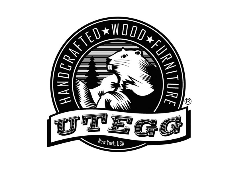
The beaver is a keystone species―their skills as foresters and engineers create and maintain ponds and wetlands that increase biodiversity, purify water, and prevent large-scale flooding. That is why I decided to use the beaver as the icon for the Utegg brand. I was tasked to create a brand "seal" to help distinguish the handcrafted work created by Utegg custom furniture from other mass produced lines. I used a woodcut look/feel and kept the logo to black and white. The owner later turned the logo into a physical branding iron and now marks (burns) all of his pieces with the seal.
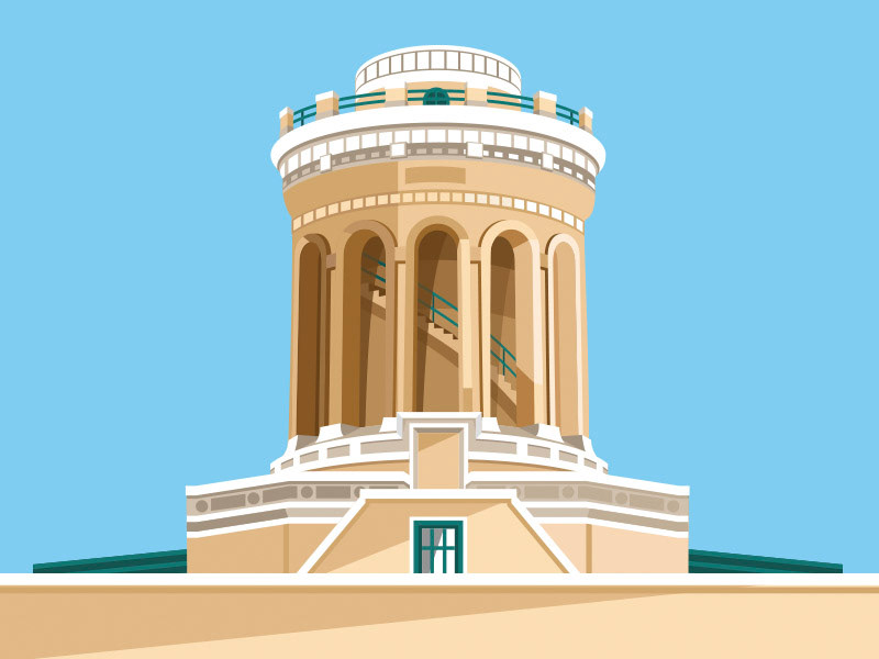
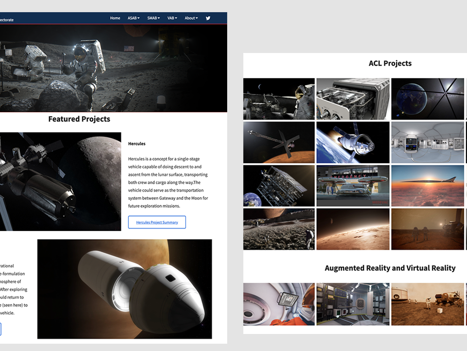
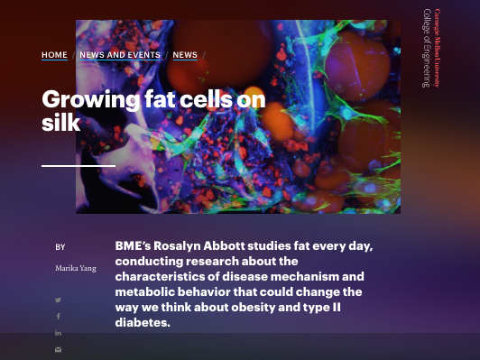
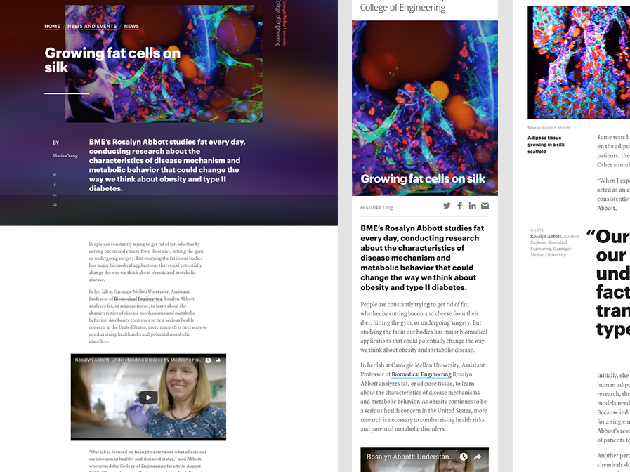
When I started working as a Digital Marketing Manager at CMU College of Engineering, the college lacked much of a social media presence. In an attempt to unify and modernize all of the digital platform under the college, I created a vector icon on the college's main building icon, Hamerschlag Hall.
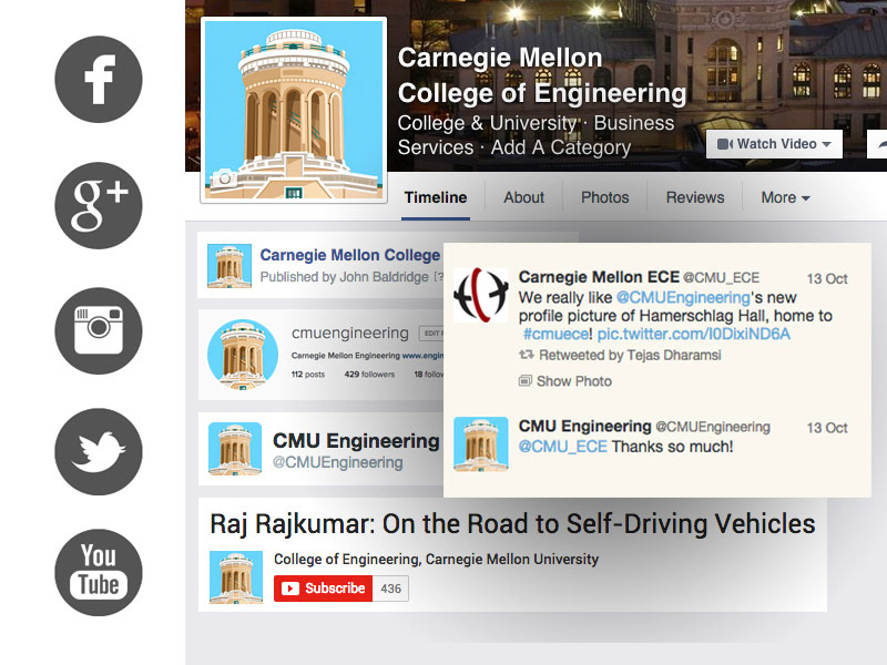
Challenge: Carnegie Mellon University College of Engineering lacked a visual mark that would unify the college’s social media and digital experience. The unit marks that the college did have were old, oblong, and not suited to the new digital age.
Solution: I created a vector visual icon mark that could be used to unify the college’s ever-growing digital experience. The icon was clean, simple, and recognizable. The icon depicts Hamerschlag Hall which is the historic home of CMU’s College of Engineering and has been a symbol of the college for many years.
This animated graphic was created to promote National Programers' Day. The graphic is a nod to CSS code and was shared over 5,000 times on social media that day.

This is the animated version of the National Programers' Day graphic.
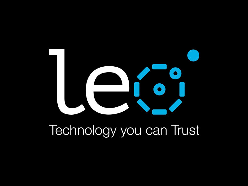
I designed this logo for a company that sells assistive technology devices and services that helps the caretaker generation keep track of both their aging parents and their own young children. Sometimes referred to as the "sandwich" generation for being tasked these roles, this product was developed to give them peace of mind.
The struggle with the Leo product is that consumers—especially older consumers—are worried about their data privacy. A US Consumer Privacy Index report conducted by the National Cyber Security Alliance (NCSA) and TRUSTe (2016), revealed that 68% of respondents cited online privacy as the thing they most worry about. That same report concludes that more Americans are worried about their data privacy than they are about losing their main source of income. That's why we introduced the tagline, "Technology you can Trust."
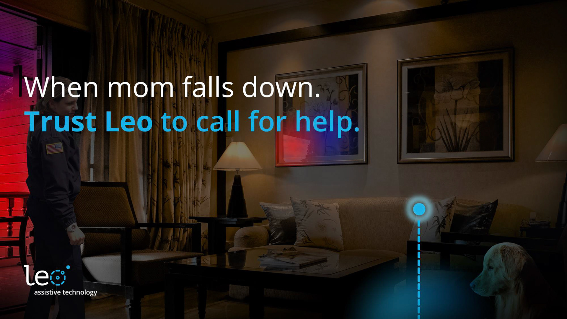
With privacy, trust, and transparency in mind, we developed a clean and modern logo for Leo. The idea is to illustrate some of the benefits (e.g., geofencing, tracking, GPS) while staying abstract enough for Leo to expand service offerings in the future. Aside from data privacy concerns, technology is often hard to conceptualize. That is why we decided to borrow positive brand equity from the original trusted companion—man’s best friend—the dog.
For thousands of year’s humans have trusted on dogs to help us see the unseen, find/track people and things we’ve lost, protect us when we’re vulnerable, and save us when we can’t save ourselves. For all of that and more, trust Leo.
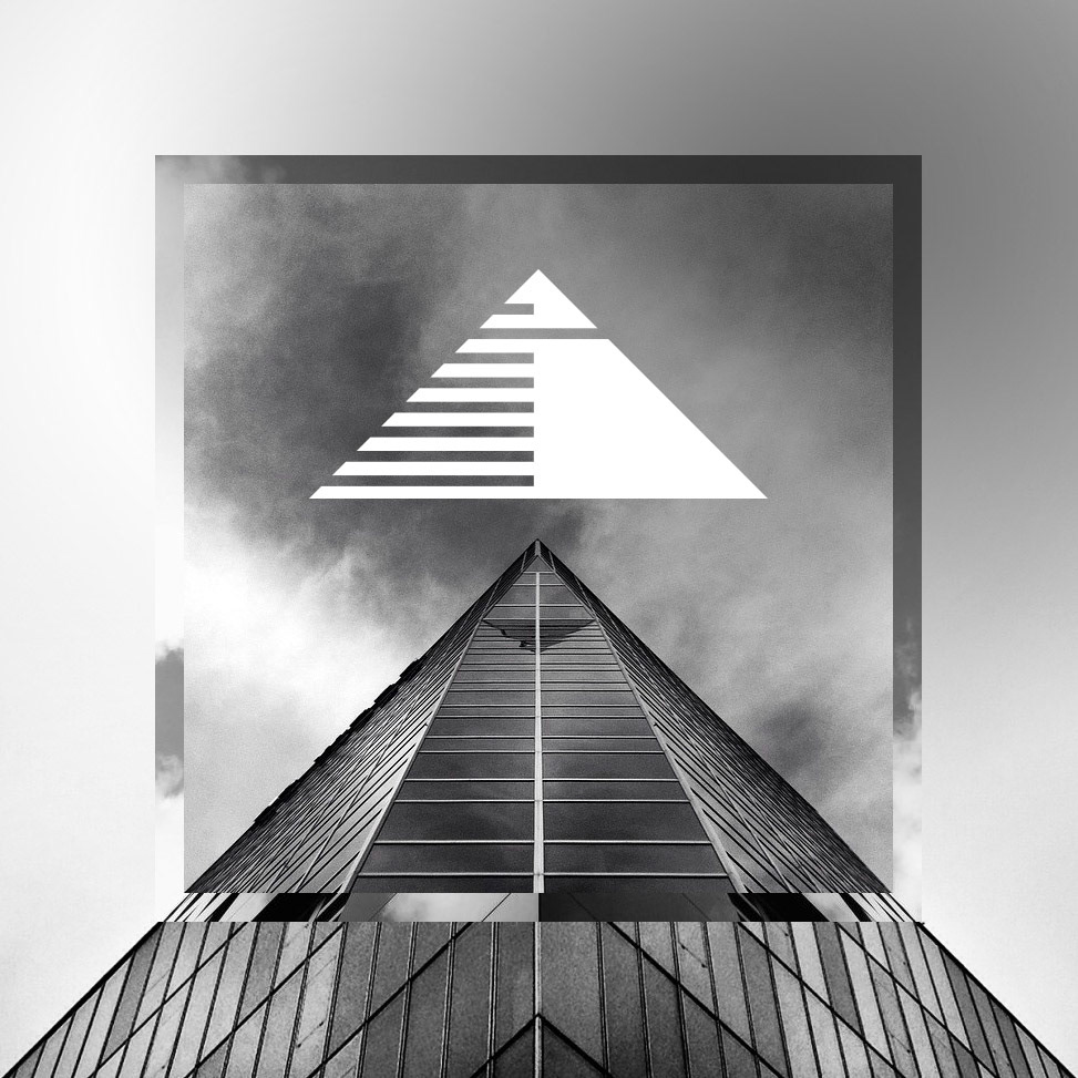
This brand identity was created for a government services contracting company. They wanted a simple icon mark but also distinctive brand photography that would allow them to better differentiate themselves in very saturated marketplace. The company is focused on benefit corporations and sustainable futures and wanted an brand that represented upward growth and innovation.
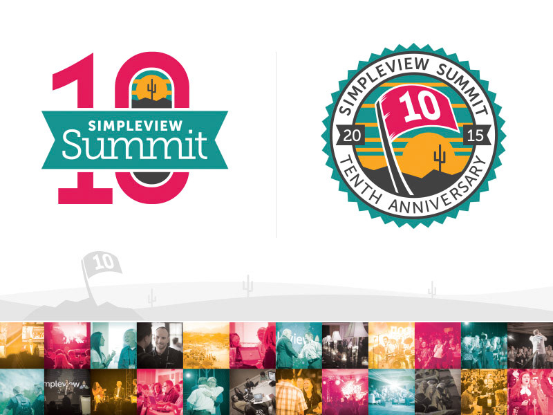
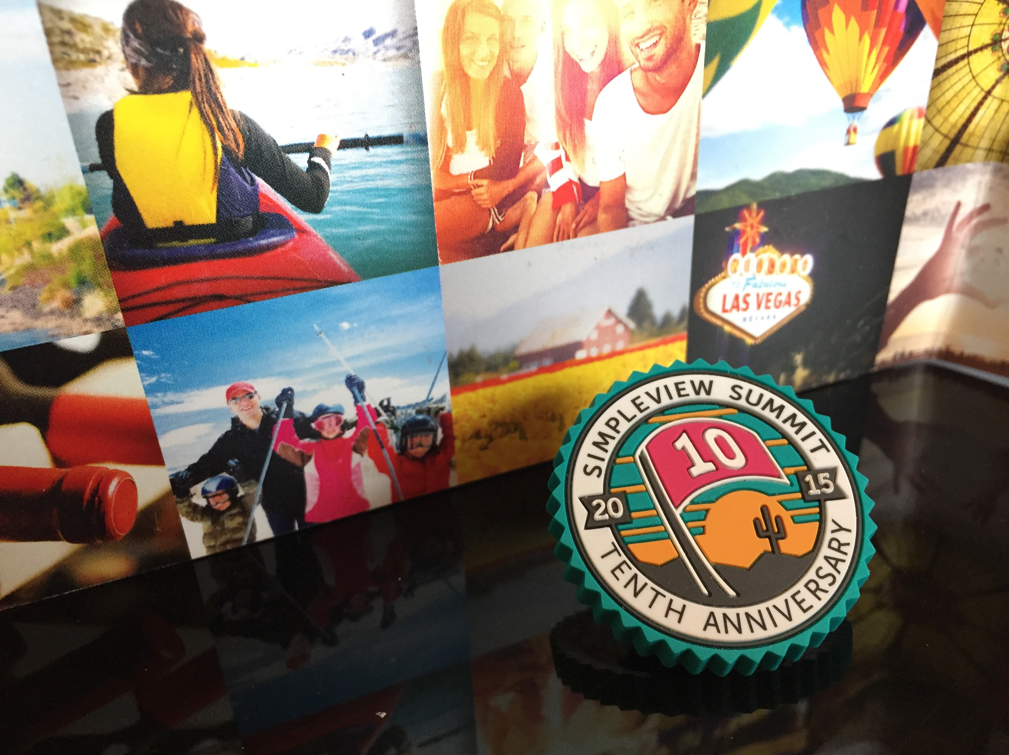
Challenge: Create a brand identity for an international destination marketing event to commemorate its ten year anniversary.
Solution: Inspired by the word ‘summit’ and the idea of reaching a milestone, I created the graphic of a flag marking a pinnacle point of an accession. The icon was placed on awards, buttons, t-shirts, and the event website to mark the special occasion.
Result: 30% increase in client attendance.
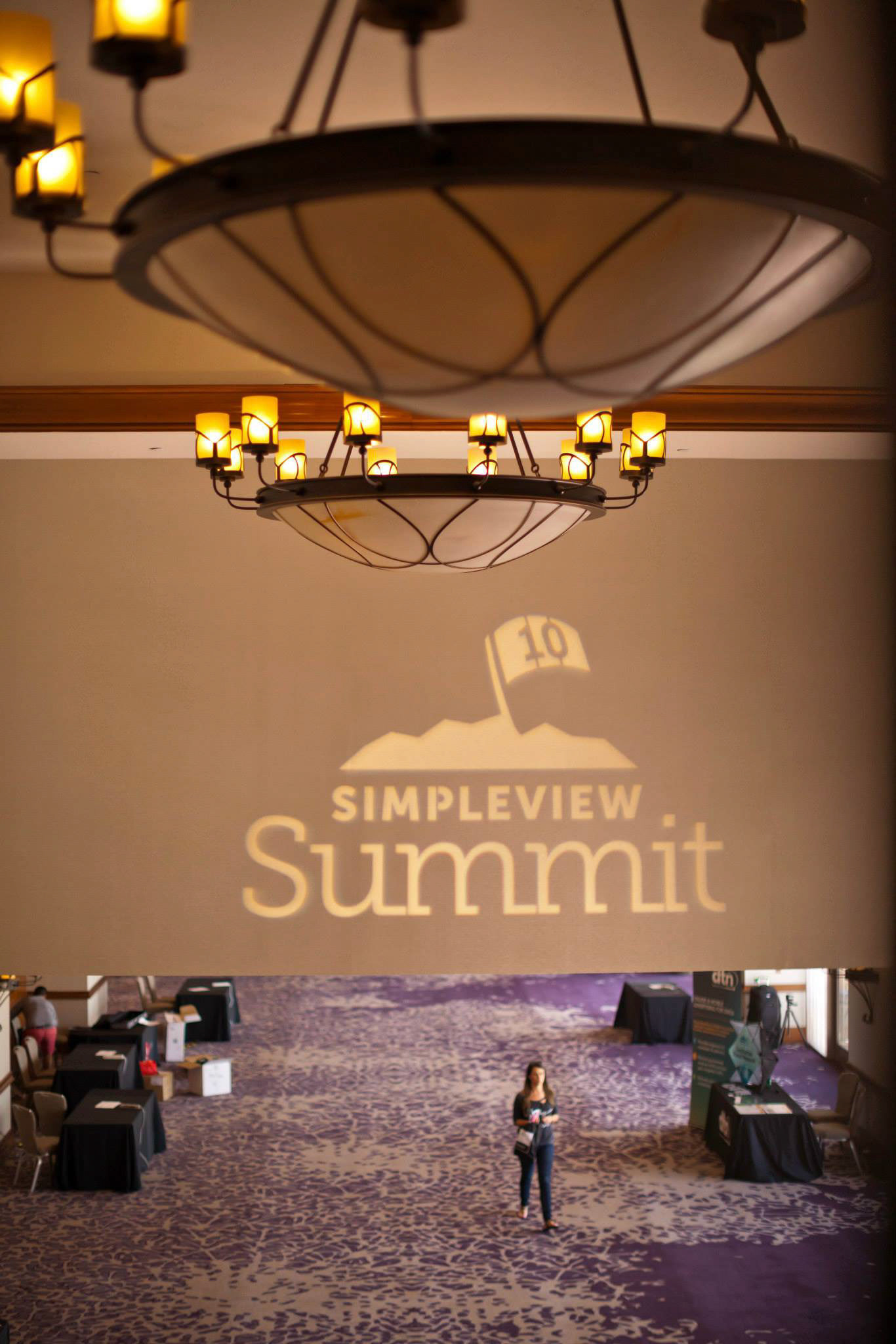
Photo showing the Simpleview logo being projected at the 10th annual Simpleview Summit.
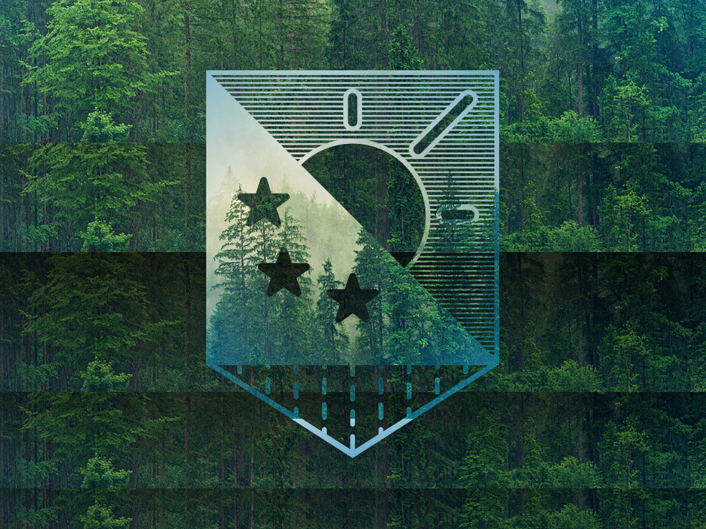
This brand idea was a result of an experiment with mood, graphic symbolism, and sound. The idea was to brand nature as something noble and worthy of protection. I also wanted to show growth and movement while being grounded in the now.